
When Population Panic Goes Viral
Fear outruns the data

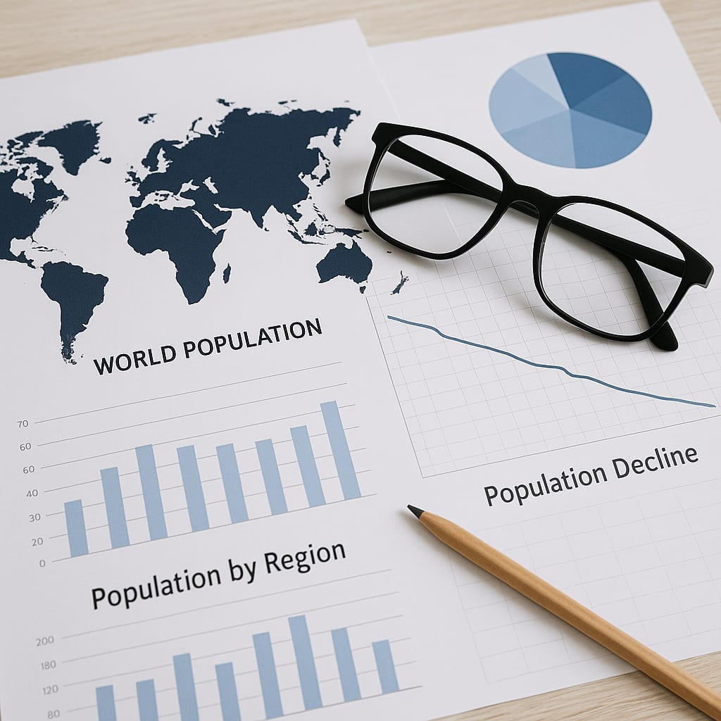
A chart shows up in a feed. The numbers are clean. The colors look official. Somebody adds one loaded word like “extinction,” and within minutes the comment section is full of panic, rage, and certainty. That sequence is common now.
It is also deeply misleading.
For decades, my career kept me close to fear, misinterpretation, and high-stakes human reaction. In my experience, most people do not respond to information or facts first. They respond to what the information feels like. Once a demographic post is framed as loss, replacement, or disappearance, the body often reacts before the mind has done any real sorting.
That is where the trouble starts.
Population claims spread faster than population science because science moves slowly and panic does not. Demography is a field built on long time spans, birth rates, mortality, migration, education, health access, economic conditions, and generational shifts. Social media is built on speed, compression, provocation, and emotional reaction. Those two systems do not move at the same pace, and the public pays for that mismatch.
In practice, high-income regions often have lower birth rates.
- People delay parenthood.
- Women gain more access to education.
- Child survival improves.
- People live longer.
- Household structure changes.
- Urban life changes the cost of raising children.
None of that is mysterious. None of it is a civilizational alarm by itself. It is part of a well-documented demographic transition that researchers have tracked for decades.
What turns ordinary demographic information into mass anxiety is not usually the numbers alone. It is the framing placed on them.
A few things happen over and over:
- A routine percentage is presented as evidence of danger.
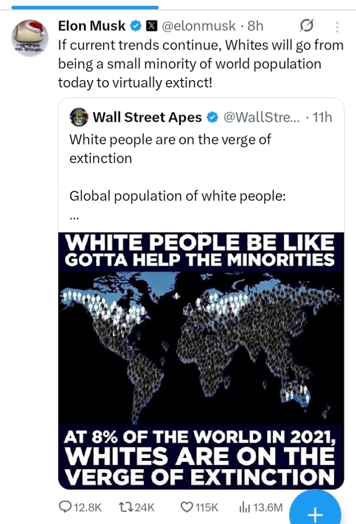
- A human category is described with extinction language borrowed from species loss.
- A chart or map is stripped of context so the image carries more force than the underlying data.
- The audience supplies the missing story with fear, grievance, or identity threat.
That last part deserves more attention than it usually gets.
Human beings are not neutral processors of identity-related information. When a post suggests that “your people” are shrinking, being outnumbered, or disappearing, a lot of readers do not experience that as a math problem.
They experience it as a threat signal. Once that happens, calm interpretation becomes much harder.
The word extinction is especially manipulative in this setting.
Species can go extinct. Human populations, ethnic categories, and social identities do not operate that way. They shift across time through migration, intermarriage, cultural adaptation, changing self-identification, political borders, and classification systems that are never as fixed as frightened internet posts pretend. Using extinction language for human demographic change is not careful analysis. It is emotional weaponry.
And it works.
It works because the nervous system is faster than the reflective mind. Threat language pulls attention. Loss language pulls attention. So does status loss, displacement, and the suggestion that somebody else is taking what was once yours. That does not mean the claim is sound. It means the claim was built to hit a vulnerable circuit. Humans.
Then the platforms do what platforms do.
They are not built to reward accuracy first. They are built to reward engagement (emotions). A post that causes alarm, identity defensiveness, or moral outrage tends to hold attention longer than a calm explanation of fertility decline, age structure, or migration flows.
As written in Digital Lynch Mobs, the system notices reaction, not depth. So the most emotionally charged version of the claim gets pushed farther and faster than the careful one.
This is where charts become dangerous props.
- A chart carries authority even when it is incomplete.
- A map looks objective even when the framing is dishonest.
- A darkened region on a graphic can feel like encroachment.
- A downward line can feel like collapse.
- A shrinking percentage can feel personal even when the underlying population remains large, stable, institutionally powerful, or geographically concentrated.
The numbers may describe distribution. The viewer experiences threat. That split between data and felt meaning is where bad actors live.
The public needs a few plain-English corrections here.
(1) A declining global percentage does not automatically mean a group is numerically disappearing. The world population changes unevenly. Some regions grow faster than others. If another region grows more quickly, your share of the total can go down even while your absolute numbers remain stable or rise.
(2) Demographic percentages do not automatically predict safety, power, or institutional decline. A group can represent a smaller share of the world population while still holding substantial resources, political influence, land, wealth, legal protection, and cultural continuity. A percentage by itself does not tell the public what frightened posts claim it tells them.
(3) The social meaning attached to a demographic post often has more force online than the underlying science. That is why these posts spread so well. People are not reacting to fertility tables and population models. They are reacting to fear of being erased, replaced, or outnumbered. Once the post reaches that emotional register, the original data has already been turned into something else.
I want to be careful here because ordinary people are not stupid for reacting. They are human. The problem is not that they feel alarm. The problem is that alarm is being deliberately manufactured out of information that requires context.
Fear can be sincere and still be manipulated.
Those are not opposites.
So when a demographic panic post crosses your screen, stop before you absorb its story whole. Look for the mechanism, not just the message.
Ask whether the post is doing any of the following:
- using catastrophe language where none is scientifically warranted
- confusing percentage change with disappearance
- treating identity categories as biologically fixed
- removing migration, economics, age structure, or education from the explanation
- using the visual authority of charts to create emotional certainty
Once you start looking for the mechanism, the trick gets easier to spot.
Population science is slow, technical, and usually unspectacular. Viral fear is fast, emotional, and built for circulation. That is why the panic so often outruns the facts. The post is not powerful because the math is devastating. It is powerful because the framing is.
That is the part people need to understand before they hand their nervous system over to a chart in a social media feed.
______________________
Sources That Don’t Suck
Bongaarts, J. (2022). Fertility and the future of population. Oxford University Press.
Caldwell, J. C. (2006). Demographic transition theory. Springer.
Heine, S. J. (2020). Cultural psychology (4th ed.). W. W. Norton.
Lerner, J. S., Li, Y., Valdesolo, P., & Kassam, K. S. (2015). Emotion and decision making. Annual Review of Psychology, 66, 799–823.
Lutz, W., & Skirbekk, V. (2018). World population and human capital in the twenty-first century. Cambridge University Press.
Sunstein, C. R. (2019). Conformity: The power of social influences. New York University Press.
Tufekci, Z. (2017). Twitter and tear gas: The power and fragility of networked protest. Yale University Press.
About the Creator
Dr. Mozelle Martin
Behavioral analyst and investigative writer examining how people, institutions, and narratives behave under pressure—and what remains when systems fail.
Keep reading
More stories from Dr. Mozelle Martin and writers in Humans and other communities.
12 Life Lessons The Golden Girls Taught Us
Picture it: Miami, 1985. Four middle-aged actresses agree to play the characters of Blanche, Rose, Dorothy, and Sophia who share a home in a TV sitcom called The Golden Girls, unaware at the time of the kind of impact the show would leave on its adoring fans. The show aired until 1992, ending with a one-season spinoff called Golden Palace. The seven years we were graced with The Golden Girls on our television screens made its mark. More than three decades after Susan Harris’ imagination sparked the creation of these iconic characters, fans from around the world still watch reruns of The Golden Girls, spend time discussing the show on social media in Facebook groups like The Golden Girls Fanatics, carry Sophia-inspired handbags and relate to the episodes in their daily lives.
By Criminal Mattersa day ago in Humans
7 Signs Your Energy Is Blocked
Do you feel drained, stuck, or constantly anxious? Blocked energy can affect your mind, body, and spirit in ways you might not even notice. From fatigue to emotional turbulence, these signs indicate that your energy flow is disrupted. Learning to identify and release blocked energy is essential for maintaining balance and vitality.
By Wilson Igbasi2 days ago in Humans


Comments
There are no comments for this story
Be the first to respond and start the conversation.